Creating neural tuning curves
Tuning curves are commonly used to characterize the properties of sensory and motor neurons, and while they appear simple, researchers actually take several steps to create them.
Description of the Data
Using extracellular electrophysiology, a researcher will record activity from one neuron while varying a parameter of interest. In our example we will explore data from Prof. John Donoghue’s laboratory at Brown University. The researcher recorded from a neuron in primary motor cortex (area M1) while the animal held a manipulandum (a joystick) and moved his arm towards a target in one of 8 directions evenly spaced around a circle on a flat plane in front of the animal. Trials of different directions are generally interwoven in a pseudorandom fashion. The animal completed 17 trials per direction.
Raw Data
Raw Data
Process Data
Process Data
The data was provided by the researcher, and needs to be converted into a more useful format for visualization. The data came in a .csv file with four columns, where each row corresponds with an action potential (spike) recorded from the neuron. Column 1 is the actual time of the spike; Column 2 is the trial direction; Column 3 in the trial number; and Column 4 is the time of the spike centered around the time the animal began moving its arm. The data contains 8 directions of motion with 17 trials per direction.
◼
We can extract the directions of motion from the data. Here the directions are in column 2, and “Union” will extract all values and remove duplicates.
In[5]:=
directions=Union[Map[Part[#,2]&,rawdata]]
Out[5]=
{0,45,90,135,180,225,270,315}
◼
Next, we group the trials for each direction. This can be used in the additional steps. Briefly, the spike times are sorted by direction and trial number.
In[6]:=
spikeTimes=Map[Last,SplitBy[Sort[rawdata,OrderedQ[{Take[#1,{2,3}],Take[#2,{2,3}]}]&],{Part[#,2]&,Part[#,3]&}],{3}];
Visualize the spike times with raster plots
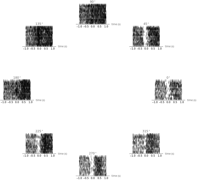
First we create roster plots to see how the neuron responds to the various directions of motion.
◼
Here, the x-axis is time in seconds and each spike is represented as a vertical line. Each row is an individual trial.
◼
First, we create the raster plots, give them titles and label the x-axis
In[7]:=
rasters=MapIndexed[NumberLinePlot[#1,PlotLabelToString[Extract[directions,#2]]°,PlotStyleBlack,AxesLabel{"time (s)"}]/.Point[loc_]Text["|",loc]&,spikeTimes];
◼
Then we draw the rasters in the format of Georgopolus, 1982.
In[8]:=
Show[MapIndexed[Graphics[{Transparent,Circle[],Inset[#1,{Cos[Extract[directions,#2]Degree],Sin[Extract[directions,#2]Degree]}]}]&,rasters],ImageSizeScaled[.85]]
Out[8]=
Create Peri-Stimulus Time Histograms (PSTHs)
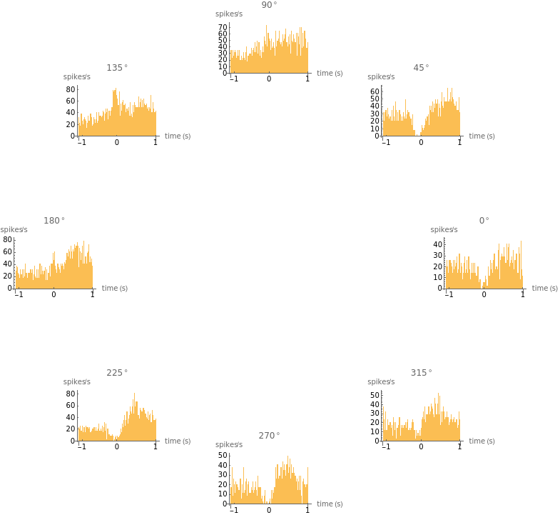
To create a PSTH, you need to bin the spikes, average over multiple trials, convert to firing rate, and display the histogram. This can then be repeated for each orientation.
◼
Here we can count the number of spikes that fall in each bin across all trials. The Flatten command looks at all the trials together, and here we have set the bin size to 20 ms.
In[9]:=
binSize=0.02;
In[10]:=
binSpikes=Map[BinCounts[#,binSize]&,Map[Flatten,spikeTimes]];
◼
Next, we average over the number of trials, and convert to firing rate by dividing by the bin size. This gives us units of spikes/sec.
In[11]:=
firingRate=(binSpikes/Last[Dimensions[spikeTimes]])/binSize;
◼
Finally, we visualize the PSTHs. The x-axis is again time, and the y-axis is now firing rate in spikes/s. Again, we use the Georgopolus format.
In[12]:=
psths=MapIndexed[Show[BarChart[#1,PlotLabelToString[Extract[directions,#2]]°],AxesTrue,Ticks{{{5,-1},{50,0},{100,1}},Automatic},AxesLabel{"time (s)","spikes/s"}]&,firingRate];
In[13]:=
Show[MapIndexed[Graphics[{Transparent,Circle[],Inset[#1,{Cos[Extract[directions,#2]Degree],Sin[Extract[directions,#2]Degree]}]}]&,psths],ImageSizeScaled[.85]]
Out[13]=
Create the Tuning Curve
To create the tuning curve, convert each PSTH into one value for each direction and create a plot of our results. We can then fit a Gaussian curve to the data to create a tuning curve.
◼
For this data, we will take the spikes between -100ms and +100ms around the time of arm movement. It needs to be re-binned.
In[14]:=
startTime=-0.1;endTime=0.1;
In[16]:=
spikes=Map[BinCounts[#,{startTime,endTime,endTime-startTime}]&,Map[Flatten,spikeTimes]];
◼
This also needs to be converted to rates (and flattened into one list).
◼
Then we manipulate the data into the form used for plotting, and we can plot the tuning data!
◼
Fitting a Gaussian to the data is a bit tricky because our x values are actually circular, and therefore our plot is technically periodic. For this particular tuning curve, this doesn’t matter much, but you can imagine the difficulty that would arise if the preferred direction of the neuron was close to 0. We can get around this by fitting the sum of two Gaussians (of equal mean and width, but with offset centers).
◼
We will seed the fit function to help it converge. Because we know the maximum value of our data and for which direction that maximum occurred, we can use that information to see the function.
◼
Now we can plot the fitted curve with out data, creating our tuning curve!
Determine the effect of bin size on the shape of the PSTH. Why should bin size always be greater than 1ms? What happens if your bin size is too large?
Represent the tuning curve as a polar plot. Why is this a useful representation?
Explore what you can and cannot predict from the tuning curve. For example, if you know the firing rate of the neuron, can you predict the value of the parameter of interest?
Monica Linden
June 22, 2017
monica_linden@brown.edu